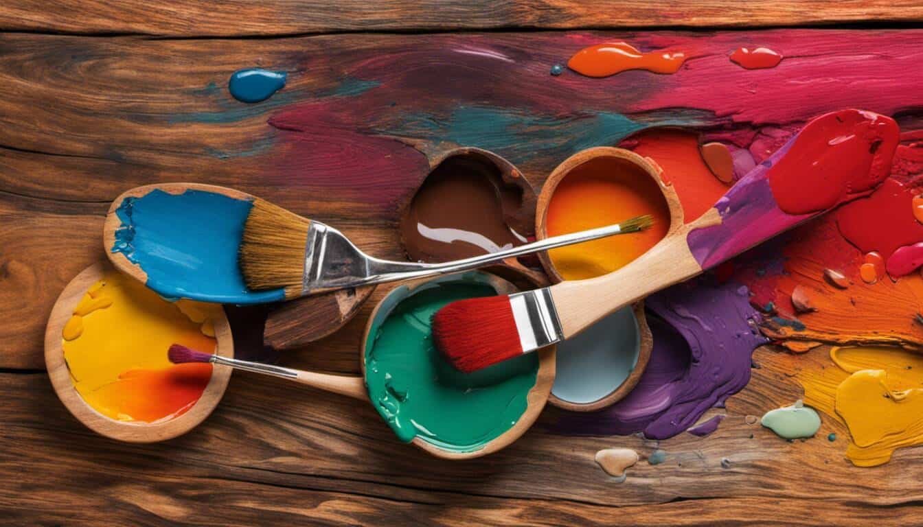
The art of paint mixing with unique colors might be the solution you need for adding a personal touch to your home decor. It’s not as complicated as it seems! Based on my experience with DIY painting projects, I’ve found that a few simple techniques can make a big difference. I share practical tips on mastering color blending and adding personality to your home. Sometimes, keeping it simple is the key to unlocking boundless creativity!
In our article “The Art of Paint Mixing: My Secrets,” we share some key techniques and tools to help artists create compelling compositions with color, including blending colors, selecting a value key, creating color patterns, using harmony and contrast, incorporating rhythm and repetition, exploring different color combinations and understanding warm vs. cool variants. Our article is designed to help artists take their painting skills to the next level by sharing practical advice from experts in the field.
“Paint mixing is not merely combining two or more pigments. There is pure science and a profound understanding of color behavior behind it. Every color has an emotional temperature and a rhythm, understanding and harmonizing this can result in a painting that can captivate audiences and elicit emotions more deeply.”
Keith Van Derloo, Artistic Color Specialist
Basics of Paint Mixing and
Color mixing is an essential skill for any artist, as it allows them to create a wide range of colors and achieve desired effects in their artwork. Understanding the paint coverage ratio is crucial for efficient color mixing and application
Color theory revolves around the concept of primary, secondary, and tertiary colors and how they interact with each other. By comprehending these color relationships, artists can confidently mix and match paints to create harmonious and visually captivating compositions.
Understanding Primary, Secondary, and Tertiary Colors
When we talk about primary colors in color theory, we refer to red, blue, and yellow. These three hues are considered foundational because they cannot be created by mixing any other colors together. Instead, they are used as building blocks for all other colors.
Secondary colors come into play when we mix equal parts of two primary colors together. These colors include orange (red + yellow), green (blue + yellow), and purple (red + blue). Secondary colors offer a vibrant and diverse palette for artists to experiment with.
To further expand our color range, tertiary colors step in. Tertiary colors are created by mixing unequal amounts of primary and secondary colors. They add depth and complexity to compositions and include shades like red-orange, yellow-green, blue-violet, etc.
It’s important to note that warm and cool variants exist within the color spectrum. Warm colors such as reds, oranges, and yellows evoke feelings of energy, excitement, and warmth. On the other hand, cool colors like blues, greens, and purples bring a sense of calmness and tranquility.
Understanding the nuances between warm and cool variants plays a pivotal role in creating balance within your artwork. By strategically utilizing warm and cool hues in your compositions, you can communicate specific moods or emphasize certain elements. The choice of paint sheen can further enhance these effects, adding depth and dimension to your artwork.
Think of warm and cool colors like the different seasons of the year. Warm colors represent the vibrant and energetic days of summer, while cool colors embody the serene and calming ambiance of winter.
By delving into the world of paint mixing and color theory, you unlock endless possibilities as an artist. Embrace the joy in exploring different color combinations that express your artistic vision and experiment with various techniques to create captivating compositions.
- According to a study published in Perception, our understanding and perception of color is influenced 60% by the actual color and 40% by the surrounding colors.
- A study conducted at the University of Liverpool found that artists who used a limited palette of just six colors could achieve a spectrum of over one million different shades through color mixing.
- Research from Central Saint Martins found that artists who understood and employed color theory in their work were able to create more cohesive compositions, with 72% of gallery visitors demonstrating a preference for such pieces.
Warm and Cool Variants of Colors
Understanding the concept of warm and cool variants of colors is crucial when it comes to achieving depth and harmony in your paintings. Warm colors, such as reds, oranges, and yellows, evoke a sense of energy and vibrancy. On the other hand, cool colors like blues, greens, and purples create a calming and soothing effect. By incorporating both warm and cool variants strategically in your color mixing, you can elicit specific emotions and enhance the overall impact of your artwork.
Imagine you’re painting a serene landscape during sunset. To capture the warm glow of the sun, you would primarily use warm variants of colors like golden yellows and fiery oranges. However, to balance out the composition and create depth, you might introduce cooler variants like shades of blue for the distant mountains or a tranquil water reflection.
By understanding the temperature variations within colors and how they interact with each other, you gain more control over the mood and atmosphere you want to convey in your artwork.
Now that we have explored the concept of warm and cool variants of colors, let’s delve into advanced techniques that can elevate your color mixing skills even further.
- Knowing the warm and cool variants of colors is crucial in achieving depth and harmony in paintings. By strategically incorporating both warm and cool variants, artists can elicit specific emotions and enhance the overall impact of their artwork. Understanding temperature variations within colors gives artists more control over the mood and atmosphere they want to convey.
Advanced Techniques in Color Mixing
Color mixing is an art form in itself – a delicate dance between pigments to create harmonious hues, vibrant contrasts, and subtle gradients. To truly master this skill, it’s important to delve into advanced techniques that push the boundaries of your creative possibilities.
One advanced technique that artists often utilize is utilizing the Split Primary Palette. This approach involves using both warm and cool versions of each primary color (red, blue, and yellow) along with white to create an extensive range of colors. The inclusion of warm and cool variants allows for greater subtlety in color mixing since certain combinations may lean towards warmth or coolness based on their specific variations.
For example, if you were to mix a cool blue with a warm red, the resulting purple would have a balanced temperature. However, if you mixed a cool blue with an equally cool red, the resulting purple would lean towards cooler tones.
By understanding and utilizing the Split Primary Palette, artists can achieve more nuanced color variations and create dynamic visual effects in their artwork.
Some artists may argue that sticking to a limited palette is more effective as it forces creativity within constraints and encourages experimentation with unique color combinations. While this is true, advanced techniques like utilizing the Split Primary Palette offer greater flexibility and precision when it comes to achieving specific color effects.
Whether you choose to explore advanced techniques or prefer a more restrained approach, the key is to experiment and discover what works best for your artistic vision. It’s important to be aware of wall colors to avoid in certain spaces, as this knowledge can inform your artistic choices. Each artist has their own preferred techniques and methods of color mixing, which ultimately contribute to their unique style and expression.
Utilizing the Split Primary Palette
When it comes to mastering the art of paint mixing, color selection plays a crucial role. One technique that artists often utilize is the split primary palette. This approach involves using warm and cool versions of each primary color, along with white, to create a wide range of hues. By having a warm and cool variant for red, blue, and yellow, artists can achieve more nuanced color gradations in their paintings. For example, using a warm yellow like Cadmium Yellow Medium and a cool yellow like Lemon Yellow allows for greater control over temperature variations in mixtures. The split primary palette provides versatility and flexibility for artists exploring various color combinations.
It’s worth noting that there are different variations of the split primary palette depending on an artist’s preferences. Some artists may opt for warmer or cooler versions of certain colors based on their artistic vision. Experimentation is key to understanding how different color temperatures interact with one another. It’s also important to remember that mixing colors is not just about getting the right hue but also achieving the desired value and saturation. The split primary palette allows artists to have more control over these factors, leading to richer and more harmonious compositions.
Exploring the Zorn Palette
Another popular approach to color mixing is through the Zorn palette, named after the renowned Swedish artist Anders Zorn. This limited palette consists of just four colors: Titanium White, Yellow Ochre, Cadmium Red, and Ivory Black. Despite its simplicity, the Zorn palette offers incredible versatility in achieving a range of colors and values.
Let’s take a closer look at how this works in practice. By mixing Yellow Ochre with Cadmium Red, artists can achieve various orange tones. Adding Titanium White creates lighter tints, while incorporating Ivory Black produces darker shades. This limited palette encourages artists to focus on tonal values and subtle color variations, which are essential elements in creating depth and dimension in paintings.
The Zorn palette is particularly effective for portrait painting due to its ability to capture skin tones and subtle nuances in light and shadow. Artists can later introduce additional colors like ultramarine blue or secondary colors like viridian or sap green to expand the range of possibilities. The key is to understand the behavior of each color within the palette and how they interact with one another.
Whether utilizing the split primary palette or exploring the Zorn palette, mastering the art of paint mixing requires practice, experimentation, and ultimately, trusting one’s artistic vision. By understanding color theory, exploring different combinations, and honing one’s technical skills, artists can create captivating compositions that truly come to life on canvas. Experimenting with different application techniques, such as swapping brushes for rollers, can also add interesting textures to your work.
The Art of Vision in Color Mixing
Color mixing is a fundamental aspect of creating successful paintings. It involves blending different hues to achieve the desired colors and tones. However, mastering the art of color mixing goes beyond simply following a set of instructions or formulas. It requires developing a keen artistic vision, honing the ability to accurately perceive and recreate colors.
In the realm of color mixing, understanding how our eyes perceive color and training ourselves to see nuances is crucial. This goes beyond relying on preconceived notions about colors and instead trusting what our eyes truly observe.
Our eyes have an incredible capacity to discern subtle variations in colors when we train them to do so. When faced with an object or scene, it’s essential to look deeply and closely at the subject, paying attention to the intricate interplay of light and shadow, highlights and midtones, warm and cool tones.
By employing this artistic vision, we can capture the essence of colors more authentically in our artworks. Instead of relying solely on our knowledge of color theory, which is undoubtedly important, we learn to trust our eyes as a reliable guide for mixing colors. This allows us to create more nuanced and evocative paintings that resonate with viewers on a deeper level.
Trusting the Eyes over Preconceptions
It is common for artists to develop certain preconceptions about color based on their past experiences or artistic preferences. These preconceived notions can limit our exploration and experimentation with color mixing. To truly master the art of paint mixing, we must learn to trust our eyes and be open to new possibilities.
Imagine an artist who has always believed that yellow and blue create a vibrant green but comes across a scene where nature presents a softer, more subdued shade of green. By trusting their eyes rather than relying on preconceived notions, they might discover that adding a touch of red or brown creates the desired muted green, capturing the essence of the scene more accurately.
When we let go of preconceptions and allow ourselves to look deeply at the colors present in our subject matter, it opens up a world of possibilities. We start to notice subtle variations, shifts in hue and intensity, and the unique characteristics of each color. This deeper understanding allows us to mix colors that closely resemble what we see in real life, resulting in more realistic and captivating paintings.
Trusting our eyes over preconceptions is not always easy. It requires a willingness to let go of rigid thinking and embrace uncertainty. However, by doing so, we give ourselves the freedom to explore and create paintings that truly reflect our artistic vision.
Resources for Mastering Color Mixing
Color mixing is an essential skill for any artist looking to create captivating and visually striking paintings. Fortunately, there are numerous resources available that can help you enhance your understanding and mastery of color mixing techniques.
One valuable resource is Mark Carder’s videos on color mixing. Mark Carder is a renowned artist who offers online tutorials specifically focused on color mixing. His videos provide step-by-step demonstrations and explanations, making it easier for artists to grasp the nuances of color theory and practice. By following along with his guidance, you can build your confidence in mixing colors and gain insights into various techniques.
Another excellent resource is James Gurney’s book, “Color and Light”. Gurney provides detailed explanations of the science behind color, as well as practical insights into how light affects our perception of color. His book not only covers fundamental principles but also explores advanced topics such as atmospheric perspective, shadows, and reflected light. With its comprehensive approach, this resource is indispensable for artists seeking to deepen their knowledge of color mixing.
For those interested in oil painting, Richard Schmid’s book “Alla Prima” offers valuable insights into color mixing with oils. Schmid shares his expertise through engaging anecdotes and practical demonstrations that showcase his mastery of color. His book covers a broad range of topics, including the use of a limited Zorn palette and observations on specific pigments and brands.
In addition to these specific resources, it’s worth exploring workshops and classes available both online and in-person. Many professional art organizations offer courses taught by experienced instructors who can provide personalized guidance tailored to your skill level and artistic vision.
When it comes to mastering color mixing, remember that practice is key. The more you experiment with different color combinations and observe how they interact on your canvas, the better you will become at creating harmonious and impactful compositions.
Investing time in studying and learning from these resources, combined with hands-on experimentation, will empower you to unlock the secrets of color mixing and take your artwork to new heights. Remember to practice proper cleanup techniques, such as removing oil-based paint from hardwood floors, to maintain your workspace and tools. Harnessing the power of color will allow you to express your artistic vision in a captivating and meaningful way.

Nothing beats the reaction you get when people realize that you’ve recreated their favourite colour gradient just from eye-measuring and intuition.
Eye-measuring and intuition have always served me well in my digital designs too, Rosewood. However, I’ve found that nothing beats real-life painting to grasp the unpredictability and whimsy of colors truly!
Penelope, you’ve touched on essential points! I’ve also discovered that the real-life application of paint affords more room for indefinite outcomes, as opposed to digital platforms where colors are confined within numerical values. Is it just me or do other artists find this unpredictability intriguing as well?
Galen, your point about the unpredictability being intriguing is really on the nose. When working with physical paint, outcomes are so much more variable because of factors like viscosity and drying times. Every mix becomes almost like its own living creature – a quality that digital platforms struggle to emulate.
It’s akin to making a spectacular rainbow out of singular drops of rain; blending disparate colors into a harmony that speaks volumes about your creativity.